Saturday, 29 May 2010

Change of header for my splash page..

As I have finally photographed all of my final products etc form my FMP - it is time to improve my website. I hate the roll over and logo which ive had for ages, its does not represnt me as I want my site to demonstate theat o am now a proffestional.

Also currenlty there is nothing on my site which gives credit to me, saying my name or what i do! So i messed around on illustartor last night and heres what ive come up wiht:


I wanted the text to be simple and bold, but still incorperated my quirky contempory style - so i filled in some of the letter forms.


Above, experimenting wiht colour as the fill in parts - too playful and had been done so many times. Also as my design work is often very colorful and bright, i do not want the logo to conflict wiht my deisgn, so black is the best option, simple and makes a statement:

Incorporating my new logo:


Below, is what my splash page looked like before the logo change, and i hate it:


After, so much better and professional:
Sunday, 16 May 2010

New mock up for website

im looking to improving the layout and apperence of my website, using a 'crab' plugin for index exhibit. This will allow the background of my spalsh page to be constant throughtout my site and make my contents box have a white backing box around it.

Here is a quick mock up which i have made, however it is not layed out propally and i do not like the background triagles after relfection, i think it is a bit too much.


Wednesday, 5 May 2010

New Logo


A new logo possibility which came from the triangle above after making it halftone for the end of year tea towel which tom and ollie are producing. Turning it half tone and changing the threshold did not look very good and you couldn't no really see the cut out elements.

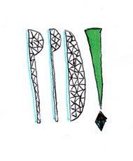
So instead i decided to vector one. I tried to convey the same cut out feeling as my original logo, making it out of triangles and arranging them in a loose order: