Sunday, 18 April 2010

Website up to date!


Sample of the roll over turning from the multi coloured logo to a simple b/w version:


Sample shots of the layout and style of the website and its contents sections:


Below was the test shot used for my page in the year book. I thought this would be a nice touch to add to   'about me' section to my website, demonstrating my 3D set making skills:


Gifs and Roll over designs


To improve my website slightly and make it slightly more interactive and professional I looked into how i can achieve a roll over effect on my logo, that when the cursor is positioned over it, it will turn a different color. Here is the sample design which i made for the roll over to turn b/w:


Or trailing it with the logo being b/w to start with and when the cursor is positioned over it turns into a higher contrast b/w:


Then i considered having the logo changing from b/w to a saturated colourway:


New Logo idea APRIL

After finding out this new technique of using the fill application i have starting applying it to all of my work. I am considering changing my logo yet again to a design which includes my name and what i do in one. this would make my site more professional and distinguishable in my opinion as my fear is that my name and what i do does not stand out enough from my splash page.


This design could be instead of my splash page, however i actually think that the 3D photograph hs more of an impact than this logo below. As my work has now shifted slightly to incorporate my collage paper craft still with vector designs i thought this logo design would be appropriate.


Geometric business card designs

After finding the new technique which Phil showed me on photoshop which is to create a simple small pattern using illustrator or hand make one - then filling and object or selected area with it i started playing around with it.


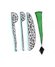
Basic vector design based on triangles:


New vector drawing filled in triangle - and then applied the shape to the card:


The above design is more effect and professional than the test design below. The text dose not fit in well being far too cramped in at the top. I was trying to have the full design and contact info all on one side of the card leaving the back free for whoever has the card to make notes on - but these designs do not work.


Idea for the back of the card, instead of using a normal bog standard format for the contact information. i trailed having the test on its side - though this is not very effective either.


New business card designs MARCH

Ive found time to start designing some new business cards as i would like to get them send off and printed the sooner the better. I am considering getting at stamp custom made with either my logo from my website of with my basic contact information. using a stamp would provide my business cards with a personal touch and it conveys my hands on design practice.


Here are some of my earlier test designs for the backs of the cards which i quickly mocked up on the train back to Leeds from home. The designs need alot of work however some of them have elements which would be be picked up on and developed.


These do not work - if i am having the front of the card busy and a photograph or scan in of one of my collages then the back should be simplistic and to the point. So only displaying my basic contact information on a plain or colored background.


However the design below works as it is only on a plain-ish background. The chosen text was helvetica, easily readable and simple.


Splash page continued


Shown in context on the splash page of my website. I still want to improve the type below my name and replace it fro hand drawn to a bold, eye catching serif font. 


Shown in context, up online:


Trailed with a spotty background to my splash page, however i think the photograph on its own works much better and it would be too much with the bright colorful logo anyway.

New splash page design March

After looking at some of Julian Valles work for MTv and Designers weekly magazine he used the technique of displaying 3D objects down in a specific gridded order on a flat surface - and then photographing the piece to present it back in 2D form.


I thought this idea was very successful and easy to replicate but in my own style. i decided to take all the key equipment which i use from day to day off my desk when i am designing, (such as my pens, pencils) then the random bits and bobs i also had hidden away on my desk. As it had juts been pancake day i have a rather strange collection including cups and lemons. I wanted all of this to be included and it made sense as it was all the elements which were on my desk/work station at the given moment in time.


Here are some of my test shots which i produced, shot in my room late one night after i had the idea and inspiration:


The test shots were successful and i liked the effect which they gave so i decided to replicate this and produce it on a larger scale at college on an A2 cutting mat instead of an A3 to give me more space to work with and include more equipment.


I thought i could combine my contact details within the set piece and then photograph it, this would be in the form of cut out paper above or arranged within the objects.


The text didn't work too well when underneath he objects, so i then trailed the cut out text piece held above the cutting mat to see if that would work better, it would give a personal touch as it would include my hand.


This was the final set design shot, however the text below my name is not clear or legible so this needs to be worked on and improved.