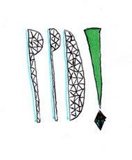
I remade a collage of brightly colored pieces of paper and cut out a rhombus instead of a basic triangle and played around with the arrangement and layout, above is the design which i came up with. I feel it is much more effective than my previous logo design, looking more professional and collective.
I took the new logo design and experimented playing with curves and its saturation to see what effective this gave the logo.


No comments:
Post a Comment