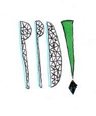
Shown in context on the splash page of my website. I still want to improve the type below my name and replace it fro hand drawn to a bold, eye catching serif font.


Shown in context, up online:

Trailed with a spotty background to my splash page, however i think the photograph on its own works much better and it would be too much with the bright colorful logo anyway.


No comments:
Post a Comment